
Client
Aldevra
Year
2025
Services
Visual system creation
A mission-driven brand brought into alignment through performance and structure
The Starting Point
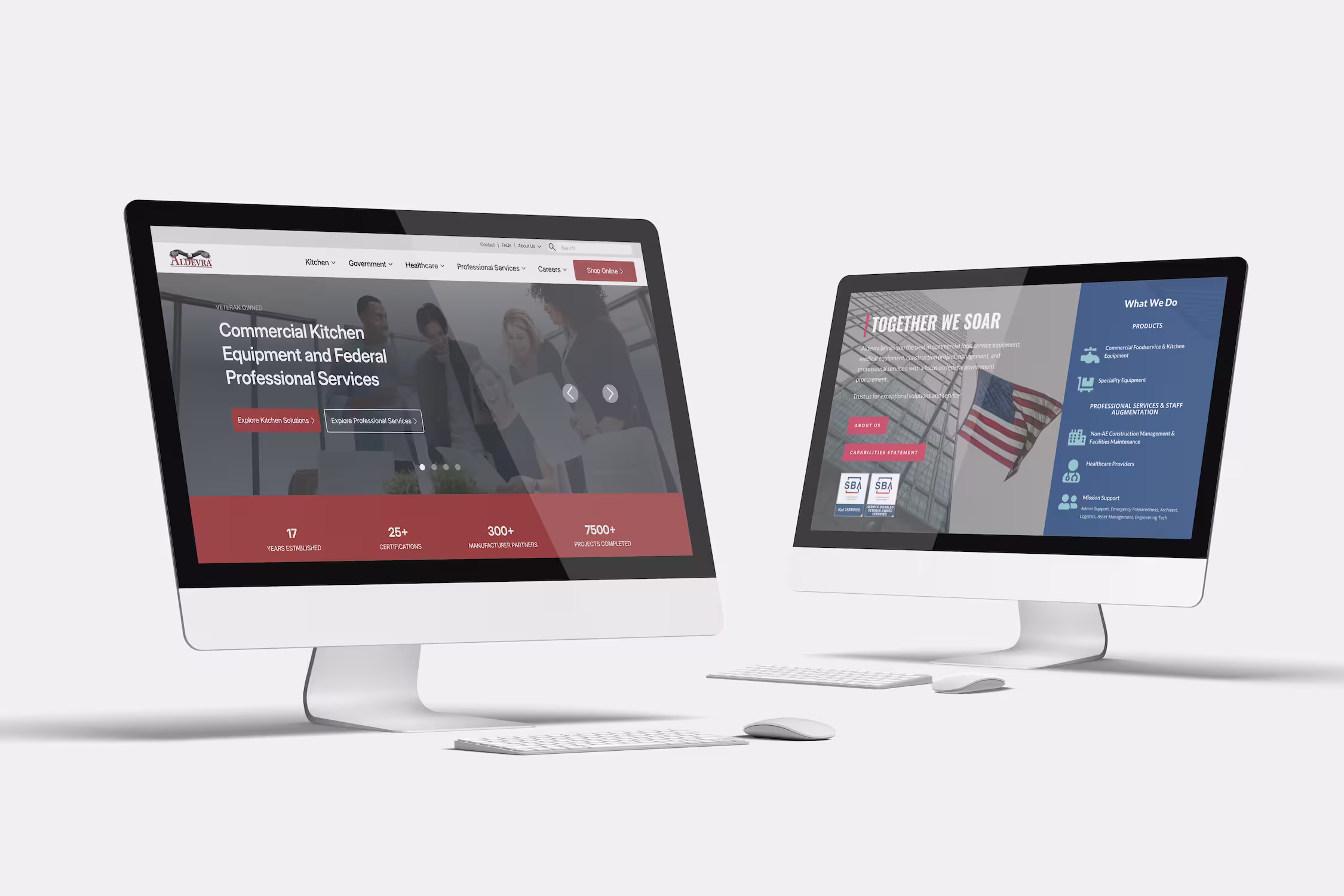
Aldevra’s website redesign was part of a much larger brand evolution.
As a trusted supplier serving government, healthcare, and commercial kitchen environments, Aldevra’s reputation is built on reliability, long-term partnerships, and service. While the brand itself had recently been refreshed, the website no longer reflected that updated direction. The digital experience felt dense, inconsistent, and difficult to navigate, especially for a site carrying as much content and as many audiences as Aldevra serves.
The challenge was not a lack of information. It was how that information was structured, presented, and supported technically.
Our Goal
The goal of the project was to align Aldevra’s website with its refreshed brand while dramatically improving accessibility and performance.
This required more than a visual refresh. The site needed a stronger foundation that could support large amounts of content, multiple audiences, and future growth without sacrificing trust or usability.
Designing for Trust and Clarity
From a design perspective, the focus was on cohesion, readability, and professionalism.
The previous website contained valuable content but lacked consistency. Dense layouts made pages feel heavy. Hierarchy varied from page to page. Repeated information appeared in different formats, creating friction and confusion for users.
The redesign addressed these challenges by introducing structure and restraint.
Brand & Visual System
As part of Aldevra’s broader brand refresh, the website design was brought into alignment through:
- A refined color palette that supports accessibility and readability
- A clearly defined typography system establishing hierarchy and spacing
- Standardized icon usage for consistency
- Modular layouts that support long-form content without overwhelming users
The visual direction balances strength with approachability. Structured, professional layouts are paired with human warmth through imagery and spacing.
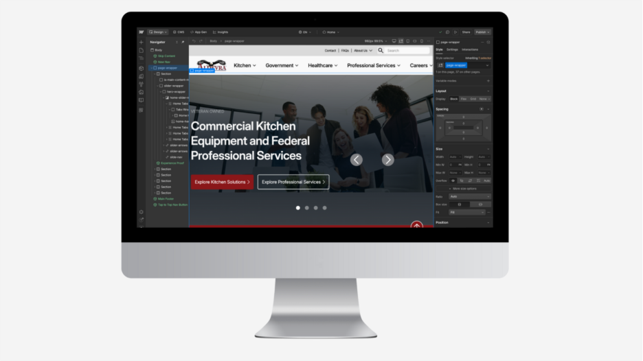
Creating a Scalable Design System
Rather than designing page by page, the project focused on building a design system that could scale.
Reusable components such as service cards, content modules, and trust indicators were developed to create consistency across the site. Flexible layouts allow Aldevra to expand content while maintaining a unified experience.
Key pages received the most strategic attention.
- Homepage, to re-align messaging and improve service clarity
- Service pages, to unify layouts and clearly differentiate offerings
- About and Careers pages, to strengthen storytelling around people, culture, and mission
The result is a site that feels cohesive and intentional, no matter where a user enters.
Rebuilding the Technical Foundation
Behind the scenes, the project involved a full migration and redesign.
Aldevra’s site moved from WordPress using the Divi theme to Webflow. This allowed for better performance, cleaner structure, and easier long-term maintenance. The previous site suffered from slow load times, heavy caching delays, and scattered content architecture.
The rebuild focused on clarity, speed, and accessibility.
Custom Development & Content Structure
Several custom sections and content systems were implemented, including:
- A Deals CMS for discounted items
- “Made in the USA” kitchen equipment pages
- Financing and FAQ pages
- Landing pages for Aldevra’s primary markets
- Buyer tools and purchasing guides
These systems were designed to organize Aldevra’s extensive offerings into logical, easy-to-navigate pathways.
Performance & Accessibility Improvements
Performance improvements were significant.
The previous WordPress site took between eleven and fifteen seconds to load. After migration and optimization, load times dropped to under two seconds. Image optimization, cleaner structure, and improved hosting played a major role in this transformation.
Accessibility was treated as a core requirement rather than an afterthought. Enhancements included:
- Semantic HTML and improved heading hierarchy
- ARIA labels and schema markup
- Skip-to-content navigation
- Custom focus states for keyboard users
- Alt text applied consistently across all images
The result was a site that achieved strong accessibility compliance while remaining visually polished.
Integrations & Tracking
To support Aldevra’s operational needs, several third-party tools were integrated seamlessly into the new site.
- NetSuite forms
- Paylocity job posting embeds
- Google Analytics, Search Console, and Hotjar
These integrations ensure Aldevra can continue to measure engagement, support recruiting, and capture leads effectively.
Balancing Complexity with Simplicity
One of the biggest challenges of the project was the scope of Aldevra’s content.
The site serves multiple industries, buyer types, and use cases, each with different priorities. The solution was not to simplify the business, but to simplify how it is presented.
Through consistent layouts, clear hierarchy, and predictable navigation patterns, the redesign reduces cognitive load while preserving depth.
The Result
Today, Aldevra’s website feels aligned with who they are.
- The brand is clearly reflected in the digital experience
- Content is easier to find, read, and understand
- The site loads quickly and performs reliably
- Accessibility standards are met across structure and navigation
- The system is scalable, maintainable, and future-ready
Most importantly, the website now supports Aldevra’s mission instead of competing with it.
Why This Project Matters
This project reflects our approach to complex, content-heavy websites.
Respect the brand. Design for humans. Engineer for longevity.
Aldevra’s redesign was not about reinvention. It was about alignment. By pairing thoughtful design with a strong technical foundation, the website now matches the trust and credibility Aldevra has built over years of service.
Our Services
Everything you need to grow on purpose
Fractional CMO
Fractional CMO leadership that carries the weight, stays obsessed with your market, and delivers executive-level strategy at a fraction of the cost.
Learn More
Websites
Webflow websites that make people get you immediately, convert browsers into buyers, and show up everywhere your customers look.
Learn More
SEO & SEM
Search strategy that gets you found everywhere your customers look, builds organic momentum, and scales it with paid when you're ready.
Learn More
Marketing Automation
Marketing automation that captures every opportunity, keeps customers engaged automatically, and gets you out of the follow-up weeds for good.
Learn More
Branding
Build a brand people understand immediately, trust instinctively, and remember when they're ready to buy.
Learn More
Socials
Social media that builds genuine connection, strengthens your search presence, and turns followers into customers.
Learn More
Let’s Get Started on Building Something Amazing Together
Schedule a call with a marketing expert today to get started on your next phase of business.
