
Client
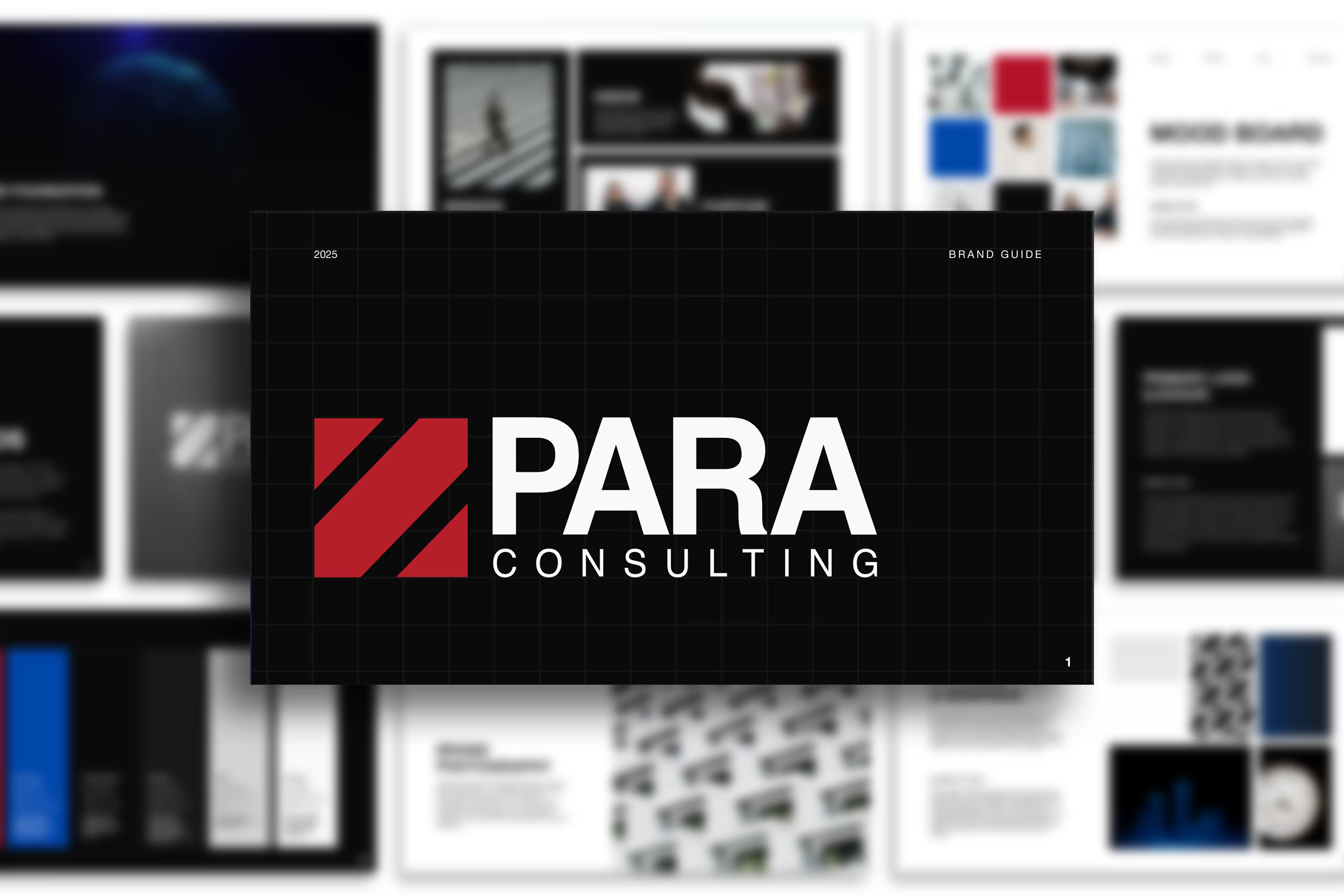
PARA Consulting
Year
2025
Services
Visual system creation
We rebuilt this consulting site from the ground up. Clean structure, straightforward approach, and designed around actual humans instead of corporate speak.
The Starting Point
PARA Consulting came to us during a pivotal moment in their growth.
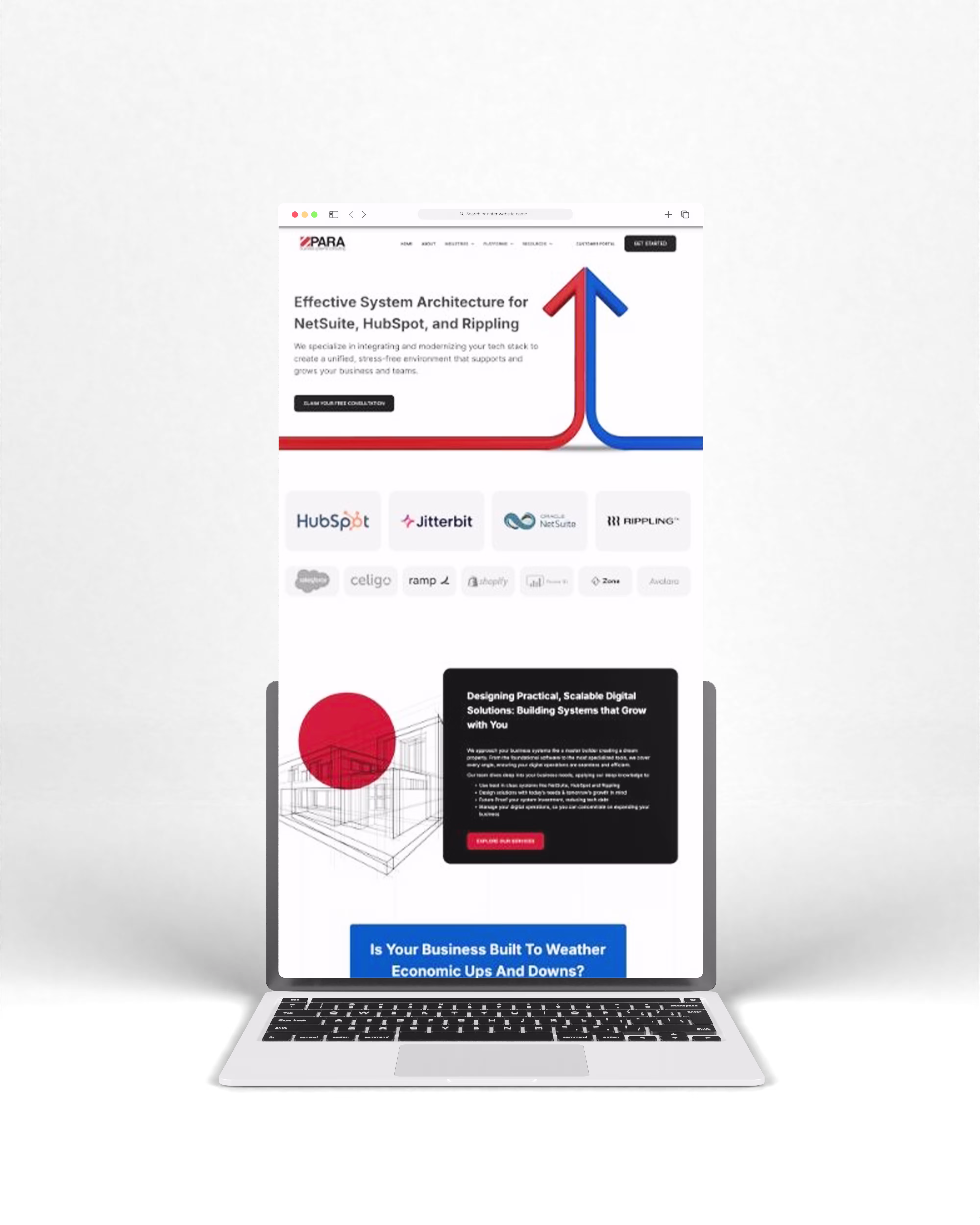
As they shifted from Para Business Systems Consulting to PARA Consulting, their brand had outgrown their current website. Although their expertise was profound and their consulting work highly strategic, the site itself appeared overly technical, visually cold, and hard to navigate. Extensive white space, inconsistent design elements, and a rigid grid layout made the experience feel more like software documentation than a reliable consulting partnership.
The challenge was how to present everything PARA wanted to say in a way that felt modern, intentional, and human.
Our Goal
The goal of the redesign was simple in concept but difficult to carry out: create a website that shows PARA as a strategic partner. To be clear, professional, and approachable while keeping the technical quality their clients rely on. This required rethinking both the visual system and the technical foundation of the site at the same time.
Designing for People, Not Systems
From a design perspective, the focus was on trust.
The previous site leaned heavily into technical visuals with blue grids, heavy icons, and stock imagery that didn’t reflect PARA’s consulting relationships or human impact. The redesign shifted the tone entirely.
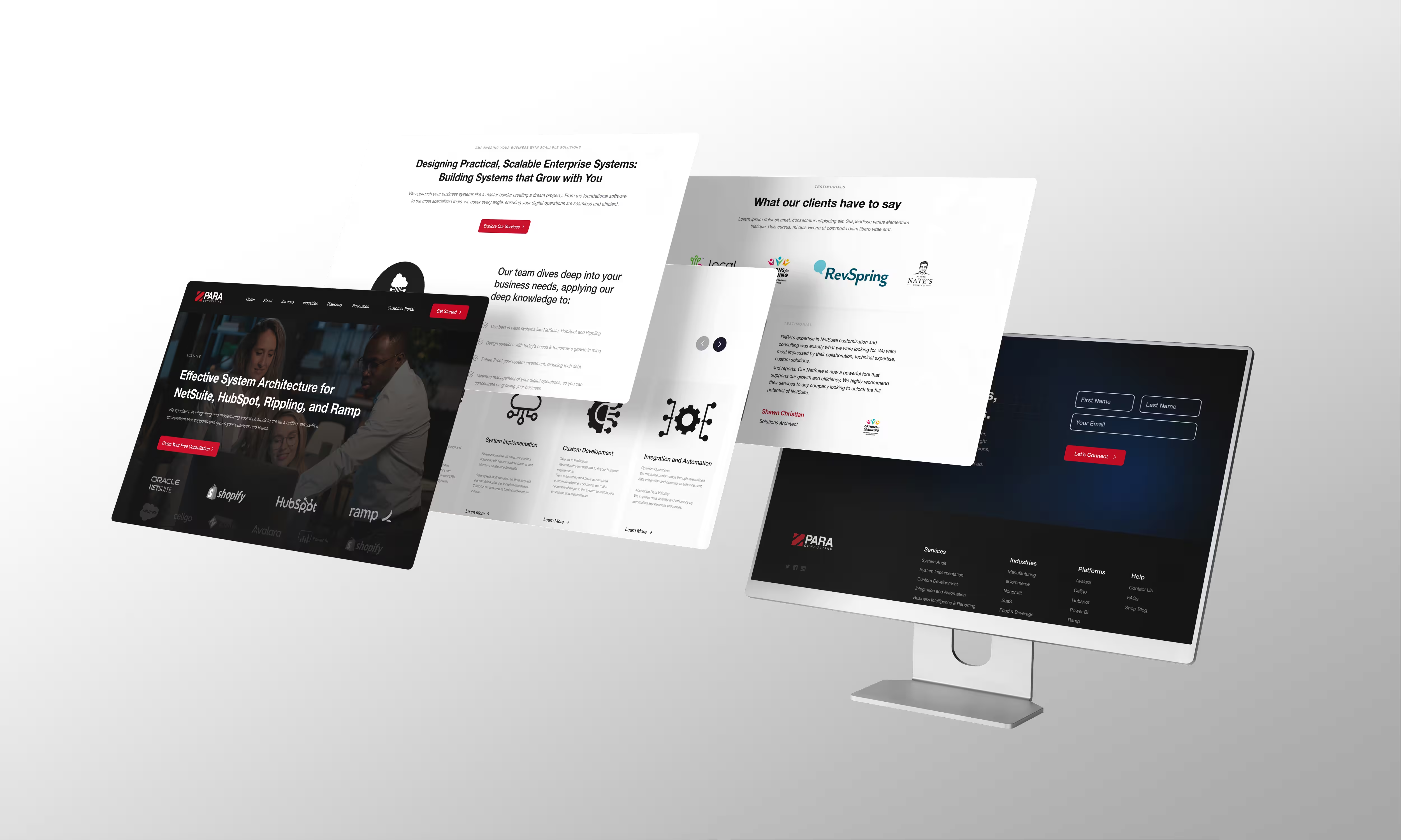
We introduced a refined visual system grounded in:
- Clean, modern consulting aesthetics
- Strong typographic hierarchy for easy scanning
- Human-centered photography to build connection
- Simplified iconography and consistent UI components
Every element (from service cards to navigation, buttons, testimonials, and section layouts) was rebuilt as part of a cohesive design system. Spacing, alignment, and component consistency were treated as first-class design decisions, not afterthoughts.
The result is a site that feels polished and professional, and no longer cold or rigid. It invites users in and guides them through PARA’s story with intention.
Rebuilding the Foundation
While the design established the visual narrative, the development work focused on structure, accessibility, and long-term performance.
The site was rebuilt in Webflow, allowing for flexibility in layout while maintaining a clean, maintainable codebase. From a technical perspective, the work centered around making the site easier to navigate not just visually, but structurally.
Key improvements included:
- Reworking heading hierarchy for logical content flow
- Implementing semantic HTML for better accessibility
- Adding meaningful alt text to images
- Cleaning up site structure to improve readability and SEO
- Optimizing images for faster load times
In addition to the core site, we built a dedicated micro-site for PARA’s Ramp-to-Odoo integration, complete with its own knowledge base and supporting content. This allowed PARA to showcase a specific integration offering without cluttering their primary site architecture.
Analytics and insight tools, including HubSpot forms and tracking, Google Analytics, Google Search Console, and Hotjar, were integrated to support ongoing measurement and optimization.
Balancing Evolution with Familiarity
One of the biggest challenges of the project was evolution without disruption.
PARA’s brand needed to move forward, becoming more consulting-focused and human without alienating existing clients who recognized the original identity. The solution was careful refinement rather than reinvention.
By pairing people-focused imagery with structured layouts, and warmth with clarity, the new site bridges the gap between PARA’s technical expertise and their role as a trusted strategic partner.
Consistency across devices was achieved through a component-based system, ensuring the experience feels intentional and cohesive on desktop, tablet, and mobile.
The Result
PARA Consulting’s website feels like an accurate reflection of who they are.
- Services are easier to understand and scan
- The brand feels modern, credible, and confident
- The site is more accessible, structured, and performance-optimized
- Technical depth and human connection now coexist naturally
The site now supports PARA’s growth instead of holding it back.
Why This Project Matters
This project represents what we do best:
Translating complex expertise into clear, thoughtful digital experiences without losing personality, precision, or purpose.
The PARA Consulting redesign wasn’t about adding more; it was about clarifying what already mattered and building a system that could support their next phase of growth.
testimonial
Working with Pastel has significantly impacted PARA’s growth. Their SEO work has noticeably boosted our lead quality. Pastel Creative has been essential in enhancing our digital presence and business expansion. We’re deeply appreciative of their efforts.

Gabriel Cruz
CTO
|
PARA Consulting

Our Services
Everything you need to grow on purpose
Fractional CMO
Fractional CMO leadership that carries the weight, stays obsessed with your market, and delivers executive-level strategy at a fraction of the cost.
Learn More
Websites
Webflow websites that make people get you immediately, convert browsers into buyers, and show up everywhere your customers look.
Learn More
SEO & SEM
Search strategy that gets you found everywhere your customers look, builds organic momentum, and scales it with paid when you're ready.
Learn More
Marketing Automation
Marketing automation that captures every opportunity, keeps customers engaged automatically, and gets you out of the follow-up weeds for good.
Learn More
Branding
Build a brand people understand immediately, trust instinctively, and remember when they're ready to buy.
Learn More
Socials
Social media that builds genuine connection, strengthens your search presence, and turns followers into customers.
Learn More
Let’s Get Started on Building Something Amazing Together
Schedule a call with a marketing expert today to get started on your next phase of business.
